ProjectSight – Assign To Modal (Web)
PROJECT DESCRIPTION
The project focused on redesigning the "Assign To" modal, which is used when someone opens a new record and wants to assign it to someone. I was given a brief overview of the issues with the current design and tasked with developing a layout that would enhance the user experience.
Before starting any project, I like to research similar designs and analyze competitors to understand why certain design elements are more effective than others. I had to present my final designs to the product trio team, as well as during design reviews and grooming sessions.
The designs needed to align with Trimble’s existing brand standards.
PROGRAMS USED


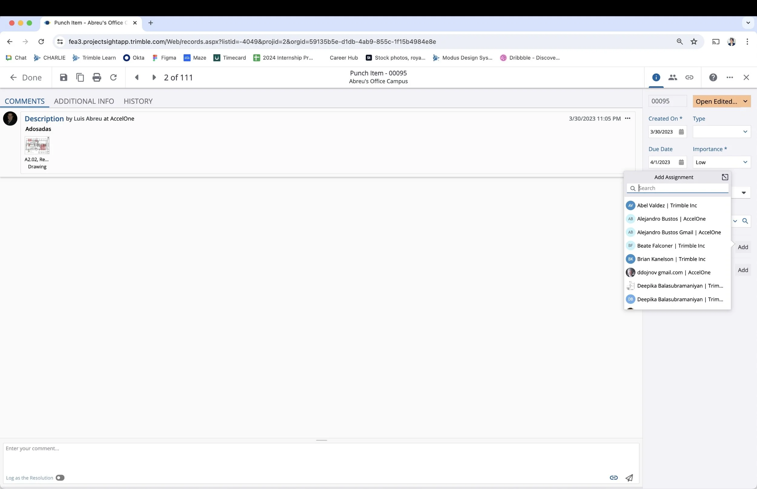
THE CURRENT DESIGN
The image on the left and bottom left shows the current design. When a user clicks on "Add," the Add Assignment modal opens, allowing them to add an assignee. If the user clicks outside of the modal, it closes. The current design permits only one assignee to be selected at a time; to add another assignee, the user must click the expand icon, which opens a new modal. Additionally, the names and companies are displayed on a single line, and the search function does not offer auto-fill suggestions.

THE UPDATE (FIRST CONCEPT)
To address the frustrations with the current design, several changes were implemented. First, I added a secondary button labeled "Create," which transforms the modal into a form that allows users to create a new assignee. One requirement was to include distribution groups in the list, but it was decided that they should only be visible if the user wanted to see them. A toggle was added to manage this feature.
Additionally, I introduced checkboxes next to each name, enabling multi-select functionality. Once a user is selected, a counter at the bottom displays the number of assignees chosen. I also adjusted the typography, placing the company name on a second line in a smaller, lighter font. A primary button was added, which remains disabled until an assignee is selected.

CREATING COMPONENTS
In the design industry, speed and efficiency are crucial. To streamline the process, I created components for the modal. This approach allowed me to make edits more efficiently, as I only needed to update the main component rather than each instance individually. It also facilitated the creation of hover effects for the prototype.

LIST VIEW
Along with redesigning the "Assign To" modal, I also worked on updating the list view, which is used when adding an assignee to a record. The left side shows the current design, while the right side displays the new design. UX isn't about having the flashiest design; it's about being intentional with the changes. Small adjustments, such as aligning the calendar icon with the other icons, relocating the grip dots, and modifying the checkmark icons, can make a significant difference in the overall user experience.

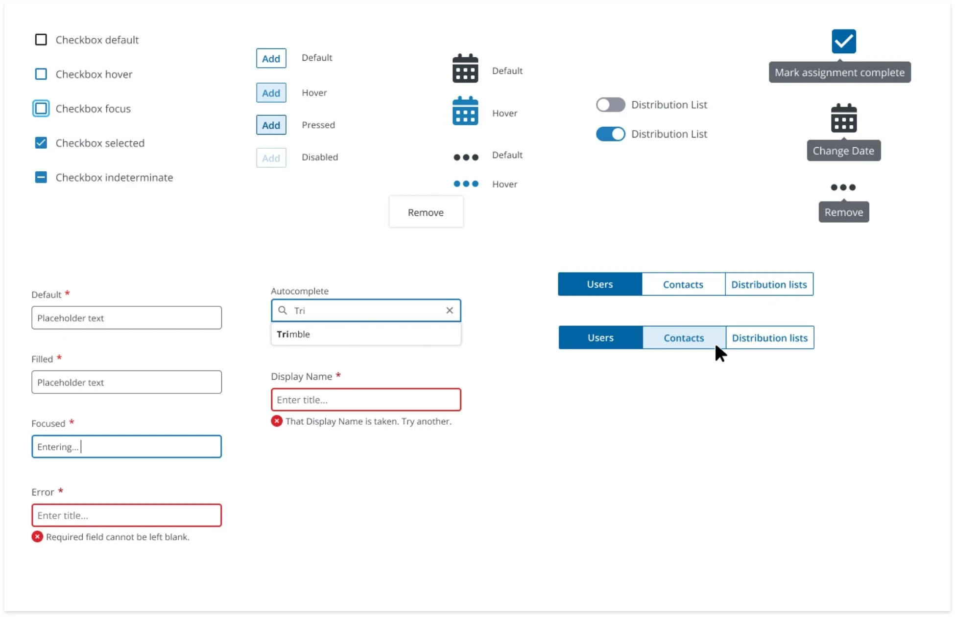
THE KEY
Once the redesign was complete, I created a key to help developers understand the behavior of the controls. This key detailed the various states—disabled, active, and hover—of specific controls, clarifying the expected outcomes when a user interacts with them.
FEEDBACK
My initial design was not the final product. However, as with any design project, I received feedback, which I always appreciate. Feedback helps me grow as a designer and understand different perspectives. Whenever I met with the team, I diligently wrote down everything they said, including positive comments. This practice helps me remember the discussions and ensures that I address every item. I enjoy going through the list and checking off completed tasks. There's something powerful about handwritten notes that keeps the process organized and personal.


FINAL DESIGN
UX REQUIREMENTS
After finalizing the design, I moved on to writing the UX requirements. This document outlined the actions of each control, similar to the key, to ensure everyone involved in the project understood how the design elements functioned. I enjoyed this part of the process because it allowed me to break down each step and gain a deeper understanding of the workflow. It's akin to designing, but with words—ensuring that the written description is as clear and effective as the visual design.
