User Experience Case Study
PROJECT DESCRIPTION
I completed this project as part of my User Experience and Usability class, which spanned 15 weeks and involved activities such as client interviews, heuristic evaluations, persona creation, and data collection. The assignment required us to select a website with a minimum of ten links and assess its usability through usability testing and evaluations.
For my project, I chose the Zer0 to 5ive website, which happens to be the website of my current employer. I intended to analyze the website's usability and present the findings to my creative director for potential areas of improvement. Following the assessment, I translated the gathered data into a high-fidelity prototype using XD. This class played a crucial role in sparking my passion for user experience.
Here is a link that includes all the content created for this course.
PROGRAMS USED
Adobe Xd
Adobe Photoshop
Adobe Illustrator
Google Slides
Google Sheets
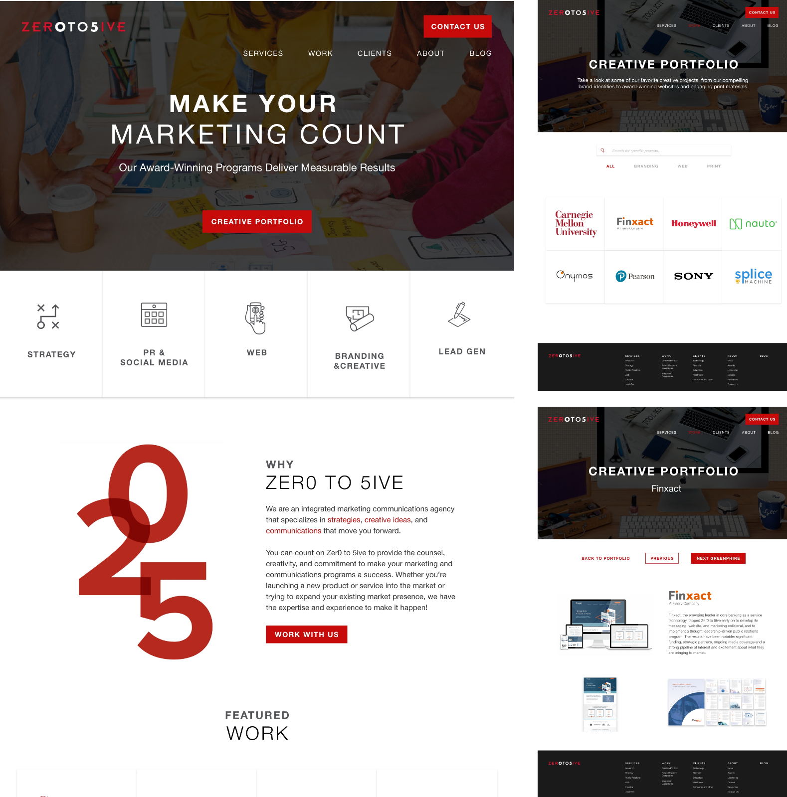
ZER0 TO 5IVE WEBSITE
As a creative agency focused on UX, Zer0 to 5ive provided an ideal chance to identify potential areas for enhancement. I aimed to share the feedback and findings with my creative director, considering the possibility of implementing any recommended changes. The website predominantly relies on product imagery to showcase a top-notch portfolio. The primary objective of the website was to encourage visitors to book a consultation, ultimately leading to the submission of a project proposal.
HEURISTIC EVALUATION
The initial phase involved conducting a heuristic evaluation following Nielsen's 10 usability heuristics for user interface design. The task required me to prepare a presentation for the client, dissecting and analyzing various aspects of the website. Each heuristic was assessed with a severity rating, offering a comprehensive evaluation. This assignment provided an opportunity to thoroughly explore the website, identifying and exploring potential areas for improvement. Throughout subsequent assignments, I consistently adhered to Zer0 to 5ive's branding by utilizing their primary colors, black and red. Here is a link to the presentation.

USER INTERVIEWS & TESTING
In addition to selecting a website, we were tasked with securing 5-10 users for interviews and usability testing. I successfully recruited seven users, each with a diverse backgrounds. I aimed to gather individuals from different age groups, varied technology experience levels, various industries, and a mix of both men and women. During the testing sessions, I assigned tasks to users without providing any guidance or influence. I meticulously noted their comments, facial expressions, and out loud remarks, while also timing how long it took them to complete each task.
To facilitate the process, I organized both Zoom and in-person meetings with the seven users. This approach allowed me to record the sessions and observe their facial expressions as they tackled the assigned tasks.

PERSONAS
Following the user interviews, I selected five out of the seven participants to create personas. While the photos and names used were fictitious, the information incorporated into the personas was derived from the actual interviews. The process of developing personas proved valuable in delineating the needs and desires of the website's users. These personas served as a practical tool for subsequent assignments, providing insights into the tasks that needed attention and potential obstacles that might cause user frustration. Here is a link to the personas.

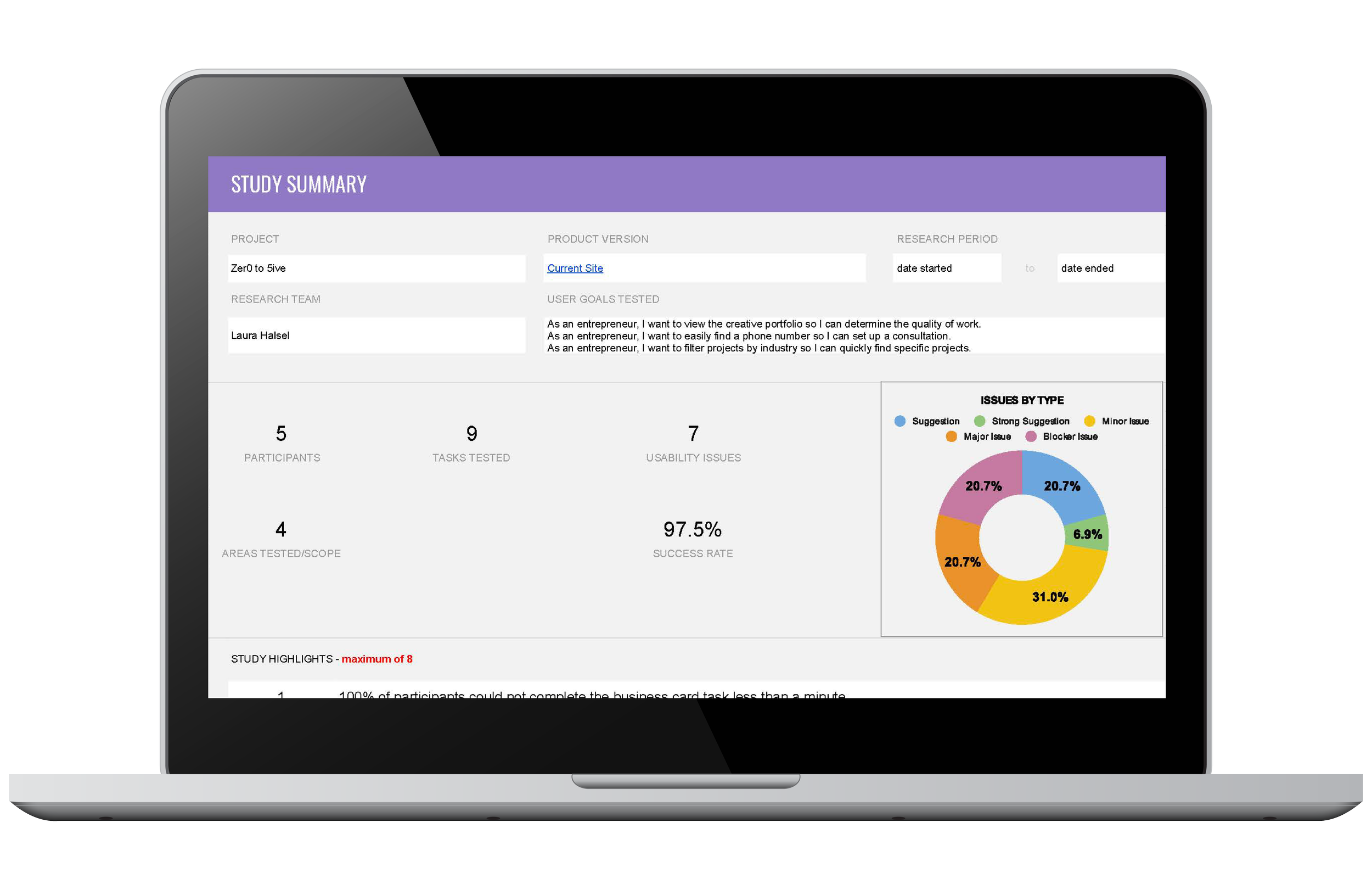
IT’S IN THE NUMBERS
After creating the personas, it was time to conduct usability testing. Prior to the test, we were required to write user stories, user scenarios and tasks, and expected paths that we believe the user would take. I scheduled the tests and began conducting them via Zoom. In no way did I help or guide the user into completing the task. I made notes about any verbal comments, facial expressions, and anything else that deemed important. We were provided a robust Google Sheet that allowed us to input our data which then calculated the sccuess rates. These numbers represented any blockers that needed to be addressed. Although, each user completed all the tasks, issues were still discovered! Here is a link to the spreadsheet.
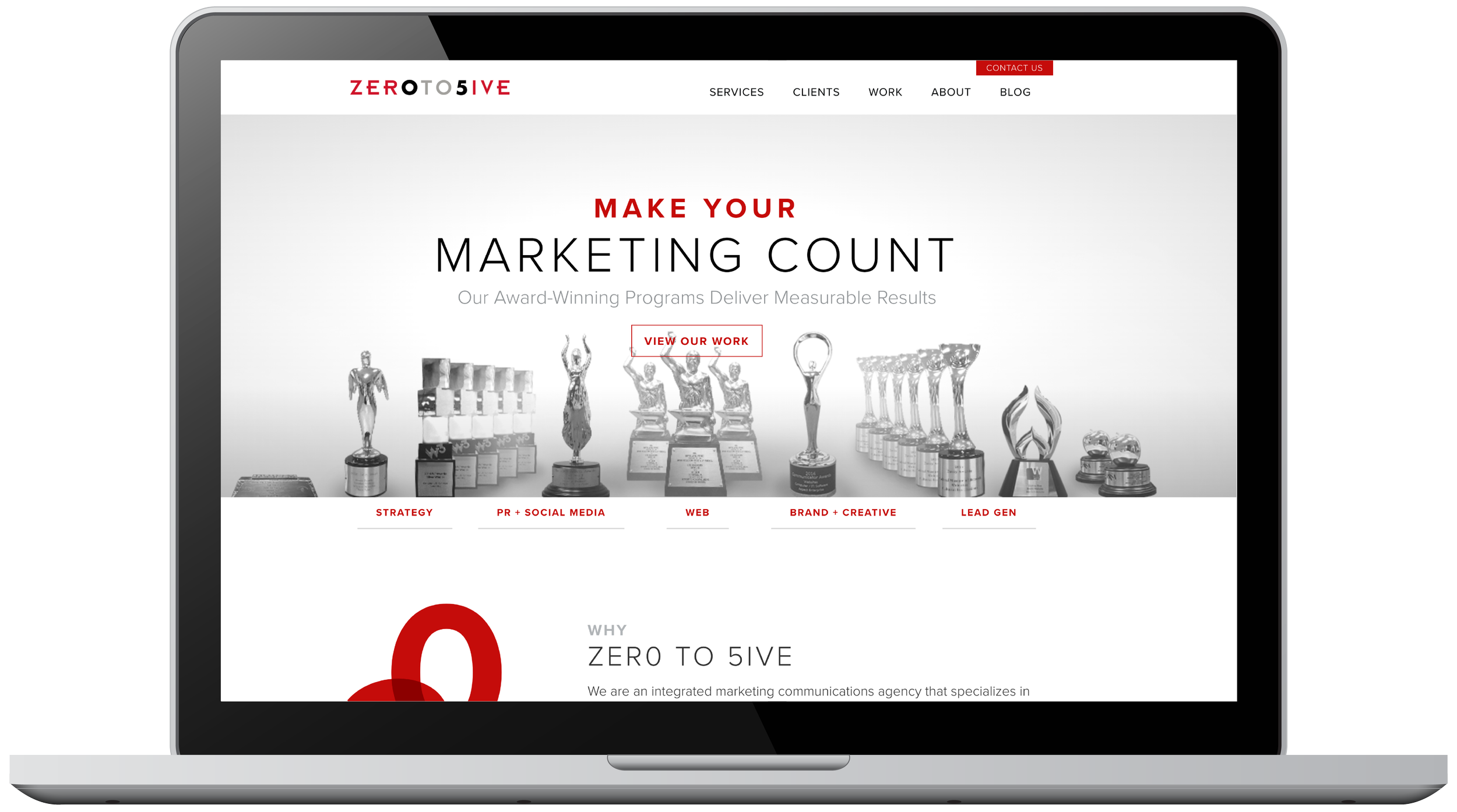
HIGH-FIDELITY PROTOTYPE
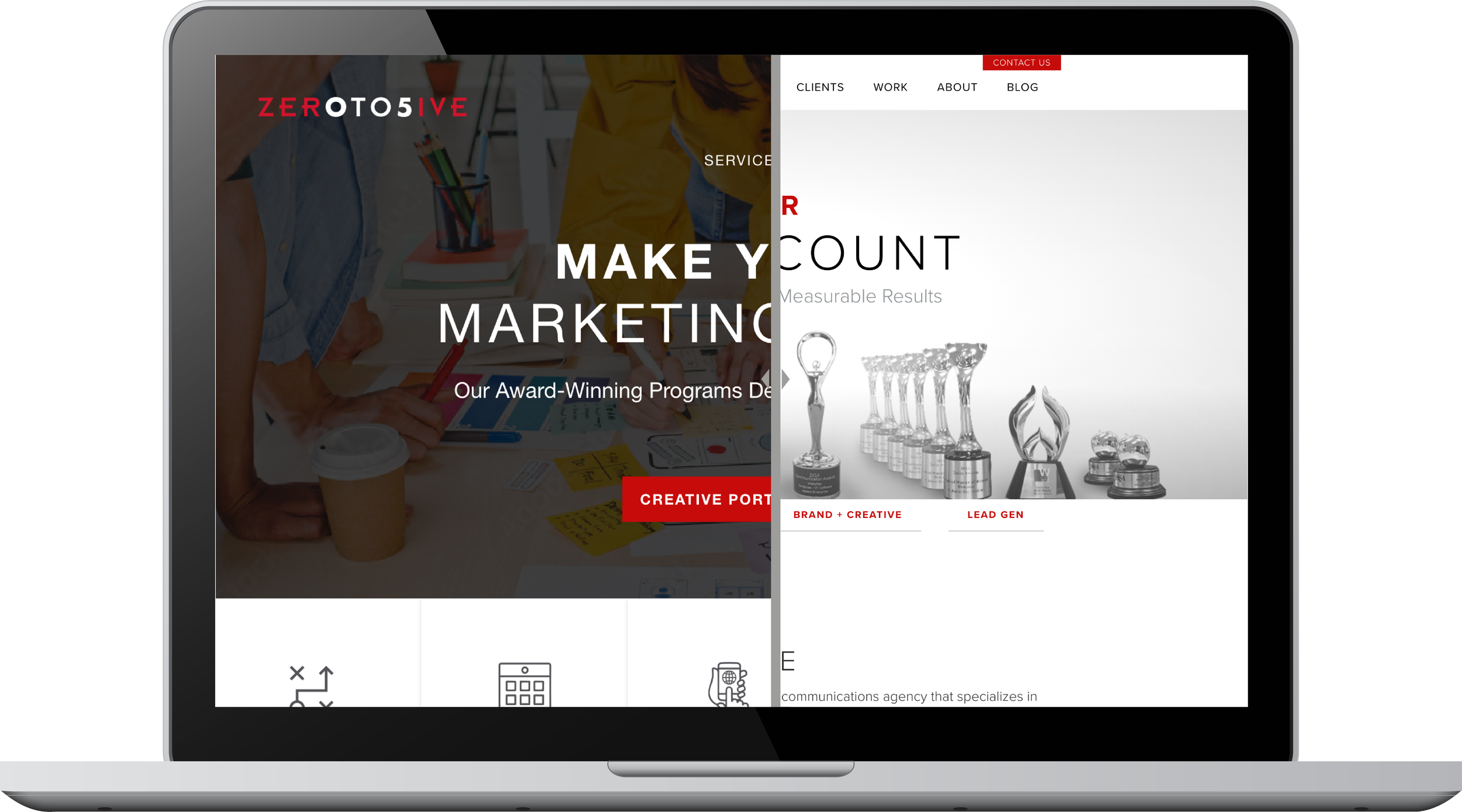
With all the collected data and the completion of usability testing, it was time to implement necessary changes. The focus of these changes centered largely on the homepage and the creative portfolio. The homepage banner image was replaced with a more creative one, and icons were introduced to enhance the visual appeal of the links below. To address navigation issues in the portfolio, I incorporated a search bar for users seeking specific projects and eliminated redundancy in client names. Additionally, the "next" button was relocated to the right to alleviate user discomfort in clicking it when placed on the left. The button also now provides information about the next client, aligning with Krug's principle from his book "Don’t Make Me Think...".
Here is an interactive prototype to see the changes in action.