LSQ Website & Branding
PROJECT DESCRIPTION
LSQ is a firm specializing in finance and payment solutions for businesses. With a dedicated team boasting 25+ years of experience, LSQ is committed to meeting client needs by adhering to their values and streamlining access to working capital. While content with their existing brand, LSQ recognized the potential for enhancement. With the launch of their new website, they sought brand guidelines aligned with the design, along with a new letterhead and digital display ads.
PROGRAMS USED
Adobe Xd
Adobe Photoshop
Adobe InDesign
Adobe Illustrator
THE WEBSITE REDESIGN
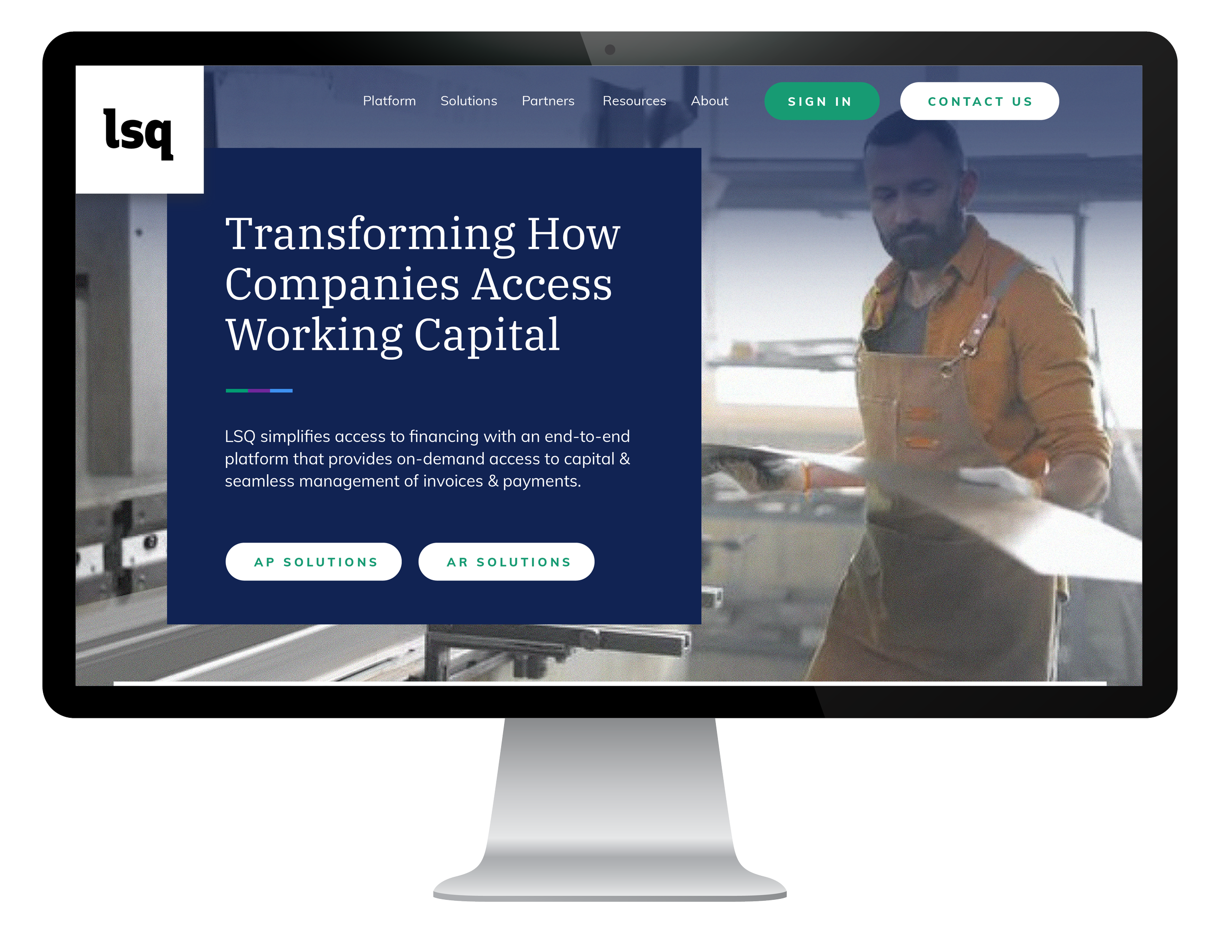
LSQ aimed to elevate its current brand, giving it a more "sophisticated" and "modern" feel. While they appreciated their existing color palette and imagery, they recognized the need for a more compelling representation. The image on the left showcases their original site, while the redesign on the right reflects their desire for sophistication and modernity. Maintaining their primary green as the call-to-action (CTA), I incorporated their secondary purple and blue as accents. The redesign's objective was to craft an engaging and interactive website with enhanced dimension. The use of large, crisp photos played a pivotal role in creating an immersive experience, and I collaborated with the client to incorporate actual pictures of their interfaces. Additionally, a subtle square background was introduced to infuse movement and depth into the design.
Here is an Xd link to the homepage, mobile, and subpages. Please feel free to scroll and explore. To see the other pages, click the left or right arrows on your keyboard. *Please note the actual website has changed since the completion of the project.

BRAND GUIDELINES
Following the completion of the website, the next step involved updating LSQ's brand guidelines. These guidelines serve as a set of rules defining the company's look and feel. Specifically tailored for digital purposes, the guide was shared internally with the LSQ team. Consistency and unity were maintained by incorporating elements such as the three stripes, square texture, and color scheme from the website. The emphasis was on creating a clean and simple guide for ease of use. Logos were directly linked to their actual files, facilitating easy downloading for future designers. Hex codes and CMYK values were provided for colors, allowing designers to copy and paste effortlessly. Additionally, paragraph and character styles were established to streamline any future updates or additions.
Here is a link to the brand guidelines.

LETTERHEAD AND DIGITAL DISPLAY ADS
Finally, I crafted the letterhead and display ads. The letterhead design adopted a minimalistic approach, ideal for official documents like contracts and proposals, as well as print applications. On the other hand, the display ads were strategically designed to promote LSQ's services across different websites. Consistency in brand identity was maintained through the use of immersive imagery and the distinctive cut-out look in these elements.
