Chatmeter Social Media Ads
PROJECT DESCRIPTION
Chatmeter offers support and services to businesses of all sizes, assisting them in managing customer engagement through social media. Utilizing their proprietary software and end-to-end platform, Chatmeter aids clients in optimizing their online presence. Seeking to promote their services, Chatmeter enlisted assistance in creating LinkedIn and Facebook ads. While their current brand was undergoing gradual changes due to various factors and leadership transitions, the transformation was expected to take time. The request was to incorporate potential design elements and minor changes in the ads, ensuring a seamless transition without confusing their existing audience.
PROGRAMS USED
Adobe Xd
Adobe Photoshop
DESIGNING THE (NEW-ISH) LINKEDIN ADS
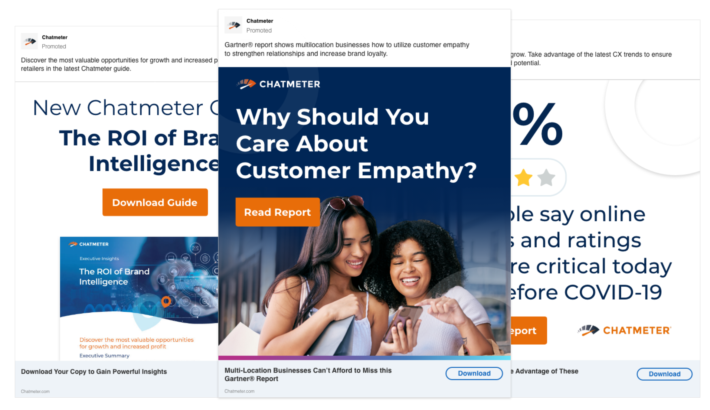
Responding to their request for updated designs, the example on the left demonstrates a subtle transition. I reduced the usage of the gradient and introduced the location icon as a watermark. The previous clash between the gradient and location icons was distracting for users, diverting attention from the focal point. The introduction of the icon watermark serves as a nod to their brand in a less obtrusive manner. By employing their primary dark blue, the white text now stands out, making the header the primary focus for readers. This slight modification resulted in increased leads and conversion rates for Chatmeter.

TYPOGRAPHY FOCUS
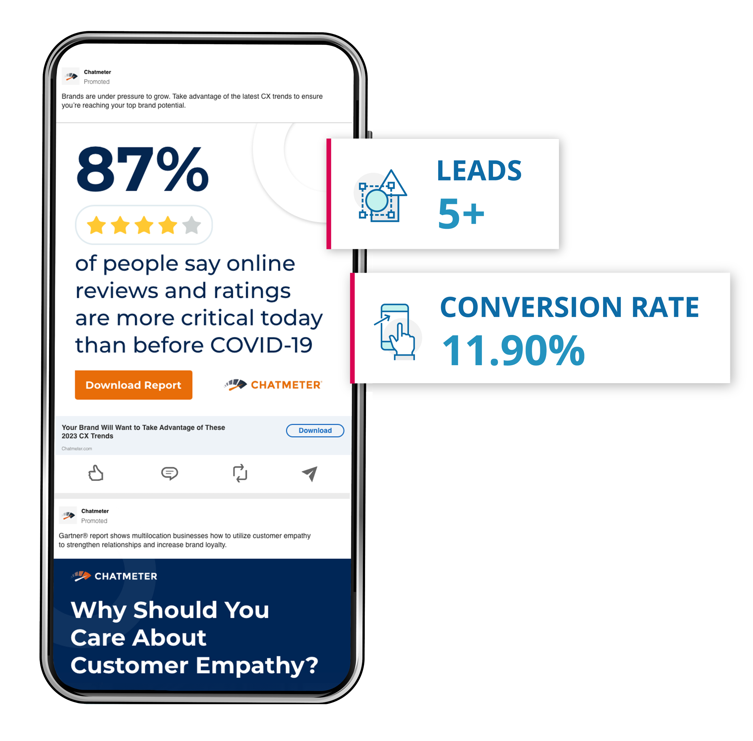
In pursuit of diverse designs, this option incorporates typography as a central element. I extracted key highlights from the copy and employed type to create a design hierarchy, complemented by a vector graphic. The color scheme was reversed, featuring a white background with dark blue text. The percentage takes center stage, serving as a focal point to convey a crucial statistic and capture the user's attention. This particular ad resulted in the generation of 5+ leads and an impressive 11.90% conversion rate, surpassing the average conversion rate for LinkedIn ads, which stands at 6.1%.
IMAGERY FOCUS
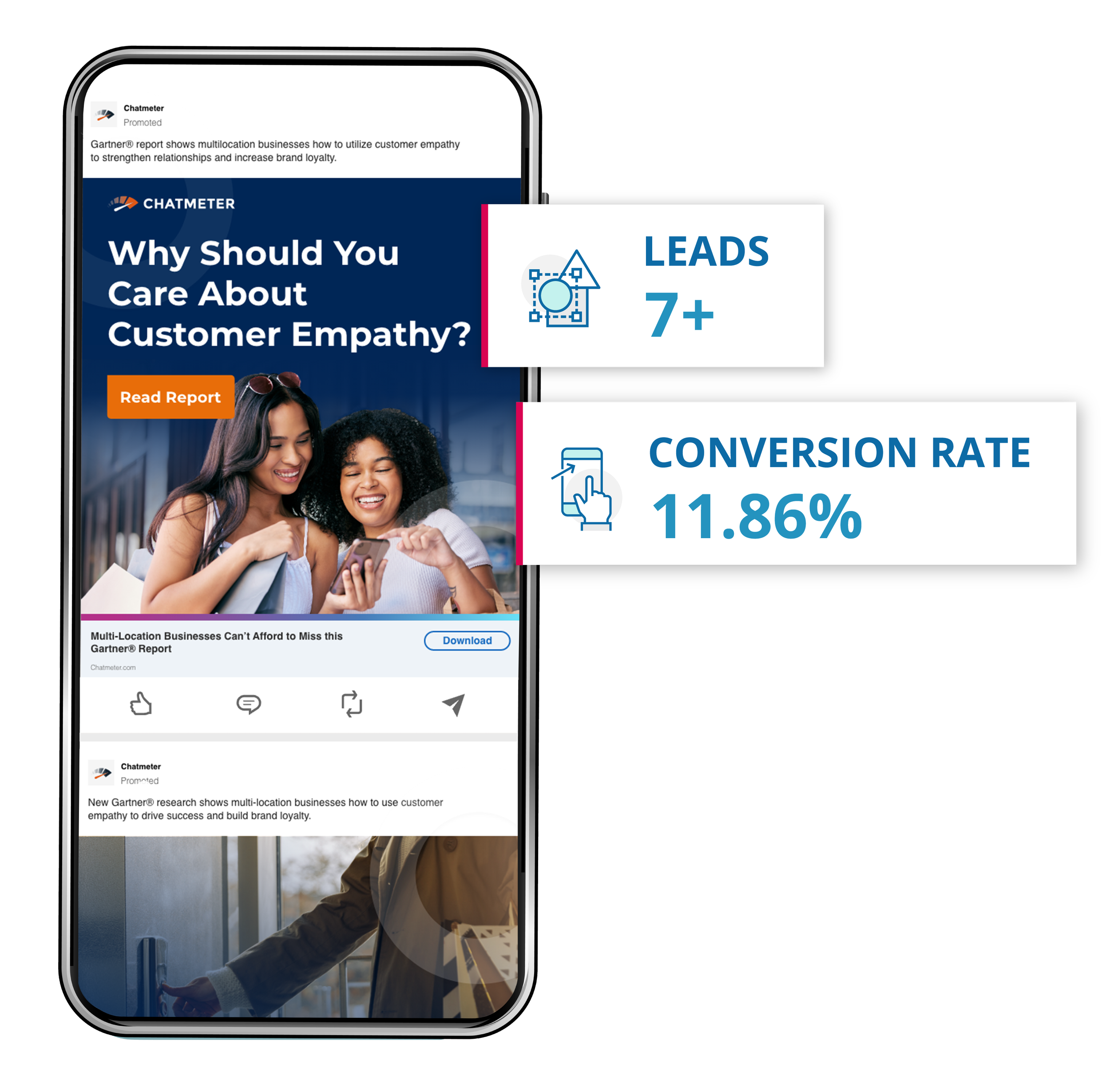
Centered on authentic photography, this ad employed Photoshop to edit the imagery, incorporating a layered approach with two images – one featuring the background and another without. This technique created depth, giving the illusion of the women "sitting on top" of the blue background. To achieve a softer transition, I applied a fading effect to seamlessly blend the image into the background. Once more, the location icon was subtly used as a watermark, maintaining a connection to their existing brand. Notably, this ad resulted in the generation of 7+ leads and an impressive 11.86% conversion rate.
GRAPHIC FOCUS
Finally, this ad emphasized the use of graphics, aiming to encourage users to download a guide. While I didn't design the guide itself, I utilized its cover to offer a sneak peek into its appearance. Varied font weights were employed to highlight specific text, set against a white background. Recognizing the guide's intricate design elements and color palette, I opted for a simpler ad with fewer distractions, adhering to the principle of "Communicate, don't decorate" learned during my design experience. This approach resulted in the generation of 6+ leads and an impressive 11.11%
